
Why Your Countdown Timer Needs to Match Your Brand
A generic timer in a polished funnel is a trust killer. Here's why branded timers convert better and how to set one up.
You've put real work into your brand. The colors, the fonts, the feel of your pages — it's cohesive and intentional. Then you drop in a countdown timer and suddenly there's a generic stock widget sitting in the middle of your carefully designed funnel.
It's a small thing. But your audience notices.
Why Branding on Your Timer Matters More Than You Think
A timer that looks foreign in your funnel — wrong colors, generic font, no logo — signals something: this was bolted on. It wasn't designed with the rest of the experience.
For most offers, that's a minor friction point. But for premium offers, high-ticket programs, or any brand built on a premium perception, "bolted on" creates doubt. And doubt kills conversions.
There's a second reason too: recognition. When your timer matches your brand, it reads as intentional. The deadline feels like your deadline — a deliberate part of the offer — rather than a pressure tactic from a tool you plugged in.
What a Branded Timer Actually Looks Like
A fully branded countdown timer in your email or on your page means:
- Your brand colors — the timer background, the countdown digits, and the labels all use your palette
- Your font — or as close as your timer tool supports
- Your logo — displayed above or alongside the countdown so there's no question whose timer this is
- Your label text — "Offer expires in" or "Your access window closes in" or whatever language fits your brand voice
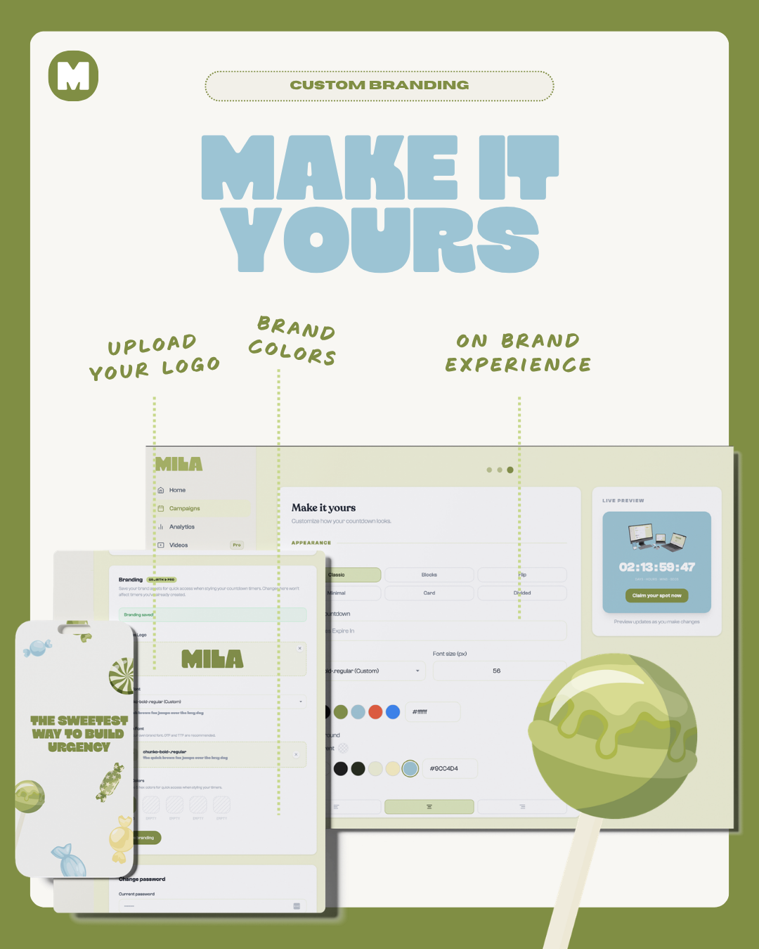
The goal isn't just aesthetics. It's making the timer feel native to your funnel, not like a third-party element your audience has to mentally step around.
The Email Case
Branding matters most in email. Your email is your owned channel — it's where the relationship lives. A timer that shows your logo and colors in that email says: "This is from me, it's part of my offer, and I stand behind the deadline."
A generic timer in a well-designed email says: "I grabbed the cheapest tool I could find and pasted the code in." Even if that's not what happened, it's what it reads as.
The Page Case
On a sales page, a branded timer reinforces the visual continuity a reader has built while scrolling. Every design element has been telling a consistent story. The timer should tell the same story — not suddenly shift to a default blue-on-grey countdown that looks like it belongs on a different site.
When You're Managing Clients
If you're an OBM or done-for-you service provider managing funnels for clients, branded timers serve a different function: they reflect your quality of work.
A timer in your client's brand colors, with their logo on it, is a detail that signals you care about the whole experience, not just the technical setup. Clients notice this even when they don't explicitly comment on it.
What It Looks Like in Practice
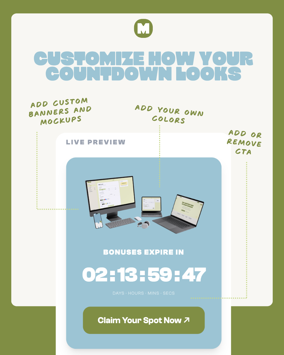
Setting It Up in Mila
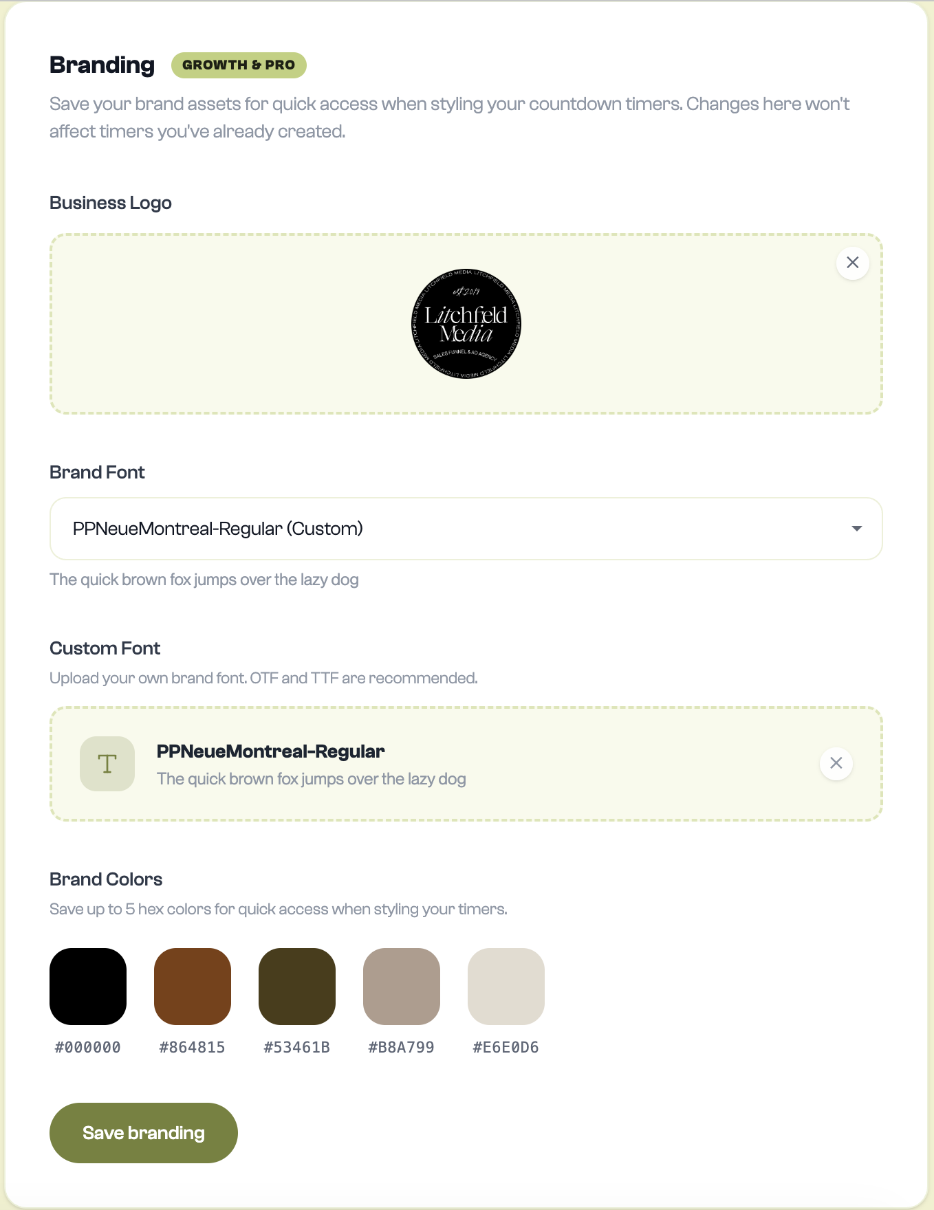
On Growth and Pro, save your reusable branding in Mila Settings, then customize each campaign as needed:
- Open Settings and save your brand colors, logo, and font. Upload a custom font file there if you use one.
- Create or edit your campaign and choose the timer colors, style, and image you want to use.
- Set the headline, time labels, and CTA text, then check the preview.
- Save the campaign and copy the appropriate email or page embed code.
For email, Mila generates an animated GIF inside an HTML embed. Paste it into your email platform's supported HTML block, or follow Mila's platform-specific instructions. Countdown digits are rendered into the image; surrounding headline and CTA fonts still depend on the recipient's email client.
Your timer is part of your brand. It should look like it. Build your first branded timer →
Ready to try Mila?
Create your first branded countdown timer in under 10 minutes. Free to start.
START FOR FREE